#will def do custom themes and layouts for other things i like
Explore tagged Tumblr posts
Text
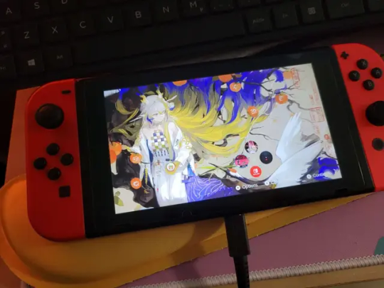
homebrewed switch custom layout shunanigans
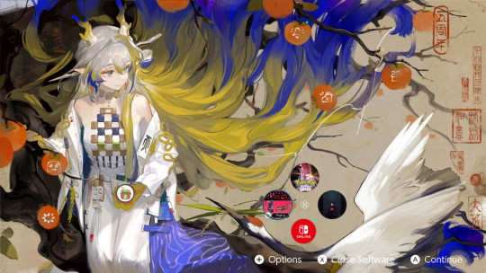
console side screenshot.
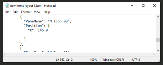
spent a lot of time aligning custom icons to fit in the persimmons and have the game icons snug in a ring.
d-pad scrolling still awkward considering lopsided layout but it works kinda.
#all the themes on that main site is boring af ngl#shame that documentation is so sparse for custom layouts but at least the installer tools work well enough#looking into doing custom layouts for the locksreen and other menus before i upload this on themezer#will def do custom themes and layouts for other things i like
2 notes
·
View notes
Note
hiii how do you start a blog??? i reallyyyy wanna post my writing but idk how to start.... like formatting a blog making a pinned doing a layout idk what im doing😭 sorry if this is random for me to ask
Hey there! ❤️ Not too random to ask someone who's constantly setting up new blogs for fun and rarely using them 😭 ✋🏼 now take this all w/ a grain of salt but fr feel free to drop by/share your stories w/ me when you post them and come back if you need more help!!
So let me try to hit the points you addressed!
Formatting a blog:
Definitely have a profile picture! This is your "face" on Tumblr ~
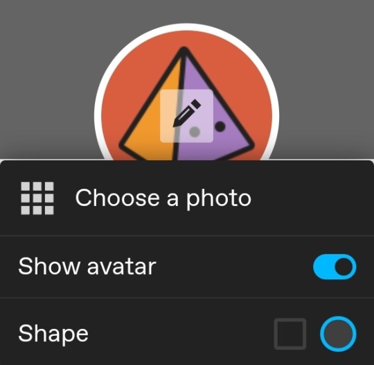
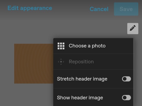
Headers are a ton of fun. You can basically do whatever you want with them - hide, stretch, use your profile picture, or create something of your own (I would not suggest taking someone's gif or something they created unless you have permission 🙏) If you want something fancy, feel free to ask someone (but check their guidelines first ofc)
I would suggest enabling a custom theme under your blog settings if you want to format the web browser/desktop version of your blog (https://[url].tumblr.com is different from the "dashboard/mobile" view found on https://tumblr.com/[url]). This can only be done in the web browser/desktop version of blog settings (and can be important for your description later)
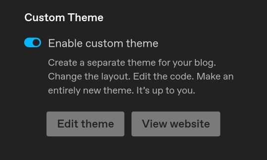
^ Confusing, I know! If you have more questions lmk, it's sort of not necessary but it's fun for me to customize 😂
You can find lots of tumblr themes to customize from the tumblr store or if you'd like you can get codes here too.
Making a pinned:
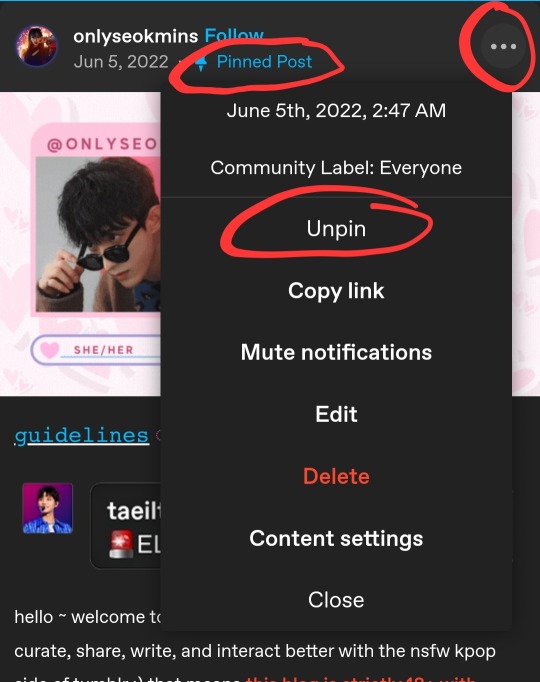
You can make any post a pinned post but only one can be pinned at a time.
Cheat: I have a habit of editing old posts that have 0 notes and/or one of my first posts and using it as I like 💀
Pinned posts can obviously contain whatever you want! Songs, funny quote, or a more detailed intro post - and can be changed any time!
Layout of your blog:
This is where creativity comes in lol! Try not to copy someone else if you can, totally cool if you're inspired but I've def seen a lot of people mimic others and it's just 😔
For example, ig you could say my layout/theme is based off a "streamer" concept lol. Some people keep it simple, some people just do whatever. Good news is you can always change it at your preference!
Honestly it doesn't matter how simple or fancy it is, I think as long as it's easy to navigate, you can do whatever.
Things I suggest to have somewhere on your blog:
Masterlist: a list of links to all your stories
Guidelines: don't be afraid to refer people to these!!
Intro: can be basic but be sure to tell a bit about yourself so ppl can interact with you
^ these can be linked in your description (code example below) and/or a pinned post
Tag navigation: (optional) much better than tumblr's featured tags option imho but if you use a specific tag for certain content/posts, make use of that!
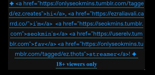
Okay so tumblr is a hellsite but it has a TON of features and things you can do with it if you want. You do need to know some html coding but thankfully it's pretty straightforward and there are a lot of resources out there. I think html is still only editable on web browser/desktop version of tumblr. So you're best bet is to hit the edit theme button below (back to what we talked abt before 😂)

I'm horrible at tutorials btw. And helping people 💀 but fr I love setting up blogs so pls feel free to hmu more! I'm looking forward to another writer in the community! ❤️
1 note
·
View note
Text
How To Customize Your Tumblr Blog!
Alright! Here is the long-awaited blog post I’ve been meaning to make for a long time now. When I was trying to customize my tumblr blog, I found it extremely difficult(especially because the first time I got on tumblr I didn’t customize my own page at all) So hopefully, this will help you try to create a masterlist, how to navigate features and implement a theme for your blog! Also I hope this can answer some questions people have if they’ve come to an error when creating your blog.
I’ll also be making a AO3 guide(mainly how to customize your writing on the HTML page on ao3) so if you’re looking for that go here.
I’ll also be making a potential youtube video for these two guides. Since I don’t have a lot of time today, I’ll be making a video on these two guides the next time I decide to revamp my blog and I’ll be sure to link those.
Alright! Let’s start!

Alright! So starting in your homepage we’d be focusing on choosing, implementing and setting up a theme for your blog.
But before we do that, I highly—HIGHLY suggest you go through your blog and delete the clutter on your page. By clutter I mean—reblogs. Or at least delete MOST of them. Reason being—if you are a fic writer(like myself) and you publish your stories on your tumblr blog, your masterlist etc; and you want to link your chapters on your masterlist or you want to locate your masterlist(the original post NOT the reblog) it’s hard to do that with all the reblogs cluttering your page. This is crucial for later when we create our masterlist. If you are a fic writer and you’ve been uploading your chapters and you already have a masterlist—locate them, copy their link addresses(which I will teach you how to get copy link addresses in this guide) and paste them on a google doc or a notes of some sort. It’d save you so much time later when creating/revamping your masterlist.
If you absolutely refuse to de-clutter your blog and/or you’ve never published on tumblr but you plan to so you don’t necessarily need to scroll so much to find your original masterlist post/story post/chapters etc; then ignore this step.
But if you are a fic writer or writer in general and you have a masterlist and/or story posts/chapters published on your tumblr blog—go ahead and scroll to find those original posts(NOT the reblog) and get their copy link addresses and paste those links in a separate google doc, notes etc. You can refer to this doc/notes when creating/revamping your masterlist/story post without having to delete any of your reblogs. I must warn you tho, it WILL take you a lot of time. Especially if you reblog A LOT. Happy scrolling!
TUMBLR THEME:
Okay—moving on—THEME! Alright so you need to find a theme for your blog. What is a theme?
A theme is a decorative set up for your blog.
But before you go looking for/implementing a theme, here is some things you need to know:
1- Many of these themes are made by fellow tumblr creators who have spent SO MUCH time creating the codes for these themes. In saying that, when you do select a theme by a creator, READ THEIR RULES! It’s very important that we’re following the rules that these creators put for some of these themes.
2 - The general rules for themes if you plan on using one:
*Do not change/steal the themes and/or use them as a base to implement a different theme.
3 - If you want to change something, look at the rules and see what you are allowed to change and what you’re not allowed to change. If its not listed, reach out to the creator to see if making these changes are okay. Generally, these creators are good at listing their rules and/or do’s/don’ts for their themes.
4 - Reblog the theme you chose! Not only does this let the creator know you’re using their theme, it also lets other people check out their page in search of themes.
Now that’s out the way—I’m going to list a couple of theme pages I frequent:
· https://maziekeen.tumblr.com/
· https://glenthemes.tumblr.com/
· https://raiidens.tumblr.com/
· https://amboise.tumblr.com/
· https://kosmique.tumblr.com/tagged/t:recs
· https://magnusthemes.tumblr.com/
· https://seyche.tumblr.com/tagged/%26themes
· https://egg.design/tagged/egg%20theme
· https://lemonfawn.tumblr.com/
· https://yeolithm.com/portfolio
· https://xuethms.tumblr.com/tagged/codes-by-xue
· https://warugaki-themes.tumblr.com/tagged/warutemas
· https://www.floralcodes.com/page/2
If you find that you don’t like any of the themes I’ve listed here, you could always search on tumblr, “tumblr themes” and a whole list of pages come up.
Once you’ve found your theme, let’s head on over to “Edit Theme.”

Once you’ve located “Edit Theme” in your settings, click on it and it’d open up to a new tab where you’d be implementing your new theme.

Today I’ll be using a theme from @maziekeen !

Once you have opened your “Edit Theme” page, you’d see that theres a bunch of functions to your right. This is where we will be implementing our new theme, specifically this bar:

Now, you’re going to click, “Edit HTML,” this will open a window that will look like this:
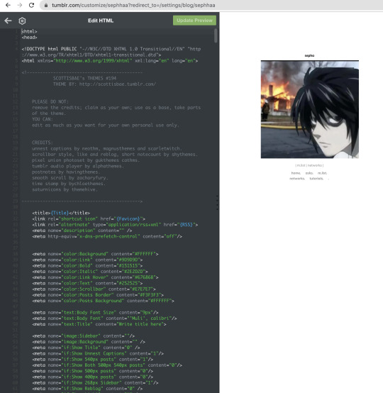
It will open up a window with a bunch of coding, here we will be deleting that code to replace it with a new code that is our new theme. To quickly delete this old code you’d press down on keys:
SHIFT+CMD+A(MAC)
SHIFT+ALT+A(Windows)
This will select all the code:
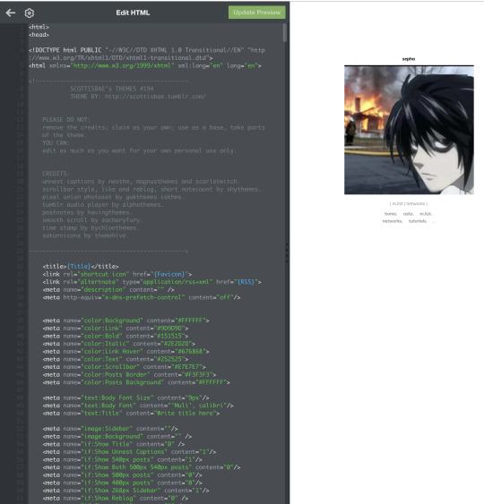
Now as you can see, all of that code is highlighted. You’re going to go ahead and delete it by clicking:
delete(MAC)
or
backspace(Windows)
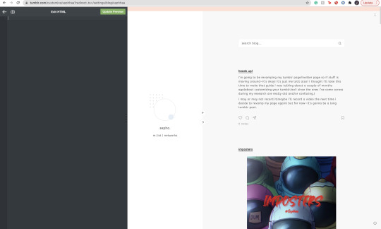
Once all of it is empty we’re going to head on over to our new code theme.

On your creators theme page(or the theme post, whichever is fine) Many creators have different verbiage for getting codes. Sometimes it’d say, “CODE”, “GET CODE”, “Download,” etc. Either way,(and in my case) you’d click “Get Code,” which will redirect you to a website to download the code.
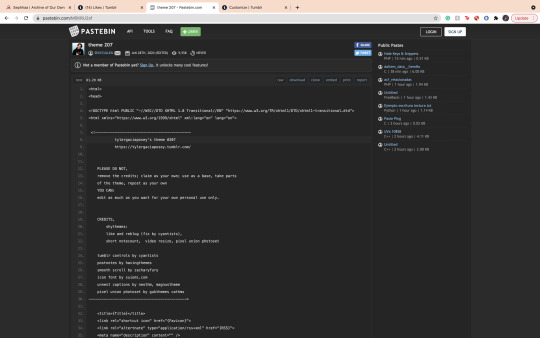
Many creators use Pastebin as a way to paste these VERY long codes. If there’s an option, you’re going to find and click “download.” If you can’t find a download option, it’s likely that you have to click “RAW” to download the code. In my case, the download option is available for me so it’d just click download and it’d open in a separate document. I find that if you download on raw, it will open to a new tab with a long list of code. Either one is fine.
I also want to mention that—some themes you might come across are priced. VERY affordable and if you have some money to spare, def buy a theme and support the creator!
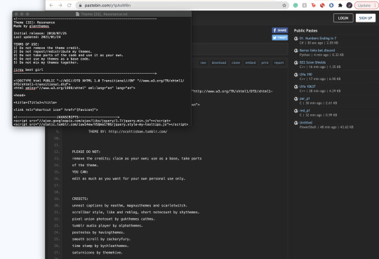
Once you’ve downloaded your theme’s code it will open in a separate doc(or open in a separate tab) with a long list of code. Here you will select all the code:
SHIFT+CMD+A(MAC)
SHIFT+ALT+A(Windows)
This will select all the code, copy the code:
CMD+C(MAC)
ALT+C(Windows)
Go back to your Edit Theme page. You’re going to go ahead and paste your new code onto the empty HTML space:

Now with your new code, you will click on “Update Preview” Once it loads, your entire page will change to that new theme’s layout:
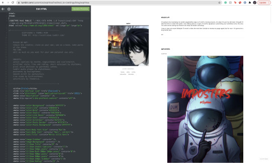
Now click save!
Alright! Now, let’s say you don’t really like the colors, or you want your profile icon to appear on said theme layout(sometimes your avatar icon won’t appear at all or you won’t have that option. If you want that option it’s likely you’re going to have to search for another theme where it’s obvious you can put your profile picture in one of the icons.) You’re going to go to the sidebar, scroll until you see all of these functions:

Here on the sidebar you can change the colors to your theme! You can also change the theme’s background, and in this case(photo icon) in the sidebar feature. You can also scroll down a bit where it says “links” and add names and links to things people can click on.
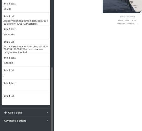
That’s all for adding your theme!!
COPY ADDRESS LINK:
Now, here is where de-cluttering your blog comes in handy. Here, we’re going to locate our chapters, story post, masterlist etc(if you publish all your written posts on your tumblr) or if you’ve already published all of your story posts/chapters onto your masterlist here on Tumblr then we need to locate the original master post.
The reason we need to locate the original master post is so that when people/readers click your masterlist—it won’t be a reblogged version of it with a bunch of writing you have previously posted on that reblog. The original, 9 times out of 10 looks a lot more organized etc.
Once you have located your masterlist—go on ahead and follow these steps:
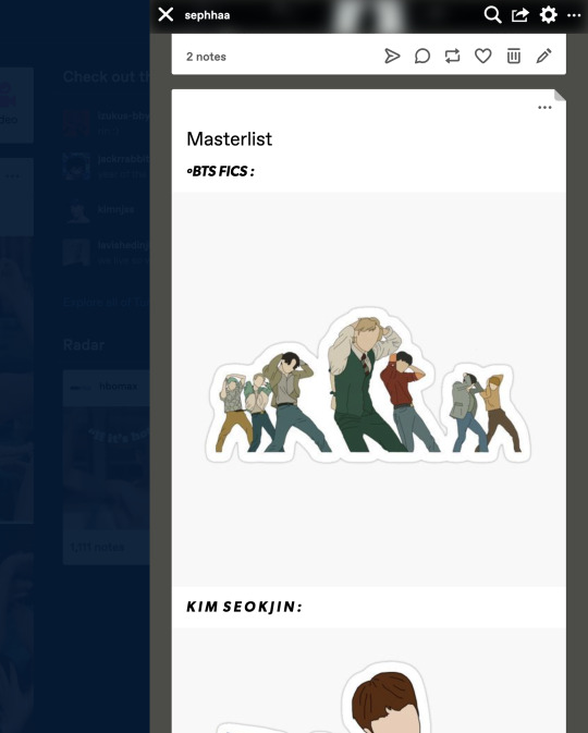
*Hover your mouse on the very top, right hand corner of your masterlist.
*A flap animation is going to appear(like the above photo)
*Once it appears, right click it
*A little window will appear, it’d look like this:
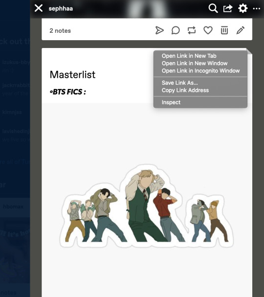
Here you’re going to click, “Copy Link Address.”
Once you have copied the link address you can place this link on your Edit Theme bio so people can click your link to your Masterlist. You can also use this to copy link addresses for all your chapters/story posts when you’re trying to link your chapters within your masterlist. I’ll explain how to do that later in this guide.
MASTERLIST:
Okay! Moving on to creating/revamping your masterlist!
If you already have a masterlist then completely ignore this step and go on over to how to put your masterlist on your bio/any errors you might have come across when trying to put your masterlist on your bio.
You’re going to go to your homepage and create a new post:
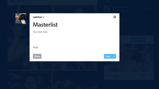
Here you’re going to title your masterlist, add images etc. Here are some features I find that a lot of people don’t know about/where to locate these features:
The, “Keep Reading” feature is a feature I find more than often a lot of people don’t know how to locate/add to their posts. The read more option is especially great if you have a really long chapter or a long post(such as this one) It’s especially helpful if you have a very long masterlist. I’m going to use my masterlist as a example to add the read more feature:

On your masterlist post, you can add the “Keep reading” feature by simply clicking the little three dots icon:

By clicking it—it immediately creates a page break saying, “Keep reading”

Another feature I find people not knowing how to do is linking their stories(story posts) on their masterlist. Here’s how to do it:

Here’s my fic, “Here’s to Forgetting 1974″ and I’m trying to add it to my masterlist. We’re going to copy the address link on this post(make sure if you’re going to add a story to your masterlist that it is the original post) once we have the link let’s go back to our Masterlist:
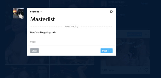
First we need to set up a title or some sort of text for this feature to work. I simply just titled, “Here’s to Forgetting 1974″ as my text. You’re going to highlight your title—immediately, a set of features will appear:
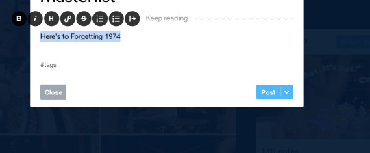
Here we’re going to click on this icon:

This will open to a smaller window to paste a link in:
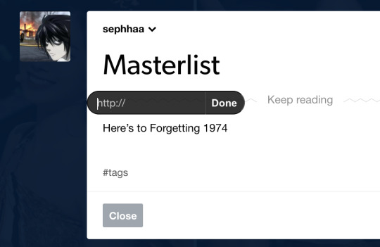
Here we will paste our copy link address from our story post onto this small window link. Once you’ve done that, click “Done.”

Immediately your title is underlined and if you hover your mouse over it and/or click it, it’d redirect you to your story from your masterlist post.
This process is similar if you want to link your chapters onto your story posts.

Here’s my story, “The Case of 1979″ and lets say I published a new chapter for this fic and I want to put the chapter link onto my story post.
*Go copy the copy address link of your new chapter
*Locate your story post:

Let’s say I’m adding a surprise chapter 12(lol)
Type your text, “Chapter 1.” “1, 2, 3″ any type of text. Here I’m just going to title my text, “Chapter 12,”:

And follow the same steps as before:
*Highlight the text
*Click on the link icon
*Paste the copy link address of your published chapter onto the https:// window
*Click done
Once you do that, hover your mouse above the chapter text/click it and it’d redirect you to the chapter from your story post.
Now that your masterlist is set up, here is the very long, and complicated process of adding your masterlist(or any link in general) to your bio.
Head on over to the “Edit Theme,” page.
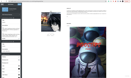
Here, we will be paying extra attention to the “Description” bar.

Now, there is a bit of coding you’d have to do here and how you write the code MATTERS:
The coding is:
<a href=“
that is:
<a SPACE href= QUOTATION MARK ( “ )
Now. You cannot—CANNOT copy and paste this code in/copy and paste your links on your bio(in case you want to go ahead and copy everything in your bio and save it on a separate doc to save for later) I love copy and paste—less time consuming etc—but unfortunately, the description bar DOES NOT like it so we gotta deal with it lol.
Now you’re going to go ahead and locate your original masterlist post, copy the address link and start setting up the format:
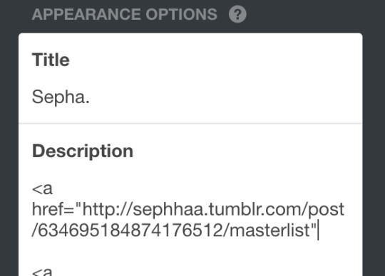
After you have pasted your link and ended it with a quotation mark( “ ) at the end. We need to set up some kind of text so that the entire link doesn’t show up on your bio. I’ll title my text: “ | M.List. | ” You can write any title, as long as its within this coding:
</a> (Beginning)
</a> (End)
</a> TEXT </a>
(of course, all together, no spaces. For the sake of this example I just want to separate the text from the code so you can clearly see what you’d have to do.)
You’re going to put your text in between this coding:
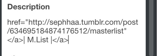
Your link should look like this and it’d appear like this on your theme layout:
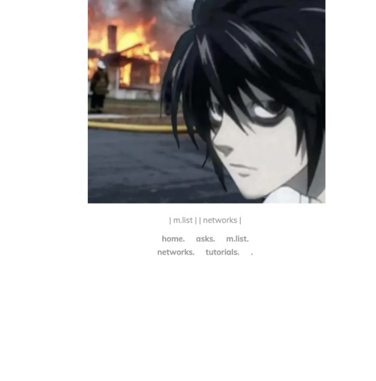
You should be able to click these links even in the theme layout.
And that’s how you set up your links in your bio!
Here is a common problem that happens when you add links to your bio. Let’s say you go ahead, go to settings and decide to change your “Edit Appearance,” to your blog:

Alright, you change your page’s coloring, the background, your profile picture—cool! Not so cool for your links!
Almost immediately, you’d find that your links will cease to work if you change your profile’s appearance. Why? because when you change it, your links are in that bio where the coloring is—those links are also being changed since they’re there.
You’d need to go back to, “Edit Theme” go to the description bar and TYPE out your entire code/text again. You can just copy and paste your copy address link of your masterlist but you’d have to type out the coding and text all over again.
And you’d have to do this every time you decide to change your Tumblr blog’s appearance.
Alright! That is all for this guide! I hope you’ve found this useful! I’ll be uploading an ao3 guide under my “guides” link on my bio where I’ll share how to navigate ao3 and all it’s weird functions. I’ll also teach you guys how to customize your writing(indenting, images, fonts(bold, underlined etc) on the HTML format in the case you don’t like the the other writing format that ao3 has to offer(it’s real ugly lowkey lol) also I’ll be providing some tips and tricks to make posting your ao3 chapters on HTML more simpler.
If you’re interested in me or my stories, I write both BTS content and Anime content( Currently it’s Voltron but I do plan on writing a fic for Death Note and Inyuasha(cuz there isn’t enough Sango and Miroku content and that’s a CRIME) follow me and give my stories a read!
Until my next guide!
7 notes
·
View notes
Text
okay turning this into a "thread" or something to that effect, y'all are getting front seats to the development of this island because hannibal fans follow me here not on my gayming blog and i want Opinions.
the island is called teacup btw. i'm working on a shattered teacup flag and i've invited Fauna to live on it. she's the deer villager that most resembles a fawn and in my head she represents the "children" of the show (abigail, georgia, mischa, wally, will & margot's kid, etc)
Beau is also there and idk if i want him to stay or not. like keeping him would be more of a nod to fanon than anything.
so the next villager i wanna invite is Graham for obvious reasons. he's kinda ugly because his color scheme is wack. like they could have given him cuter clothes he's actually cute if you give him other clothes. and if i remember correctly his house is insane. but idc. his name is Graham. how can i leave him out. i'll even put him next to the dock and give him a little fishing area and some bug models.
i'm considering villagers with meat-themed names like T-Bone and Pancetti. i favor Pancetti over T-Bone because she's a pig and like. that's just so fitting lshkskhz
i also want a few dog villagers because it just makes sense. def tempted by Lucky because he reminds me of will AND chilton and i love his house. Butch also. and Goldie. i just love all dog villagers ough
i'm also thinking of Bluebear bc you know. bluebeard. also Hugh and Hopkins and Phyllis and Snake but these are more backup than anything
kinda tempted to have Antonio as one of my villagers as a nod to anthony dimmond bc he's one of my faves in the show but idk yet we'll see.
okay next. i have no fucking clue what to do with the layout of buildings. i have no clue where to put anything. i know a few things i want? like i want the entrance to resemble the norman chapel (which i can't do just yet because i need to design a floor and figure out how to give the impression of walls) and i want the cliffs on the top left of the map to be a nod to the wrath of the lamb. i'll have red dragonfly models in there and a video camera on a tripod and. other stuff idk i'll figure it out.
i want a castle area for hannibal's childhood home with like mischa's grave and abigail's next to it. i might have Fauna live in there? and i'm considering using one of those custom designs that look like big void as the "holes in the floor of the mind" or whatever it was that hannibal said. i'll have firefly and snail models in the area. the museum would fit stylistically near the castle area but it wouldn't in the sense of like. it would be an area that hannibal would frequent often and the castle would be an area he'd avoid. so like. idk.
i have no clue where the hell to put the shops and the campsite also. and other things that like are part of the functionality of the island? like i need to have a "farm" space for the in-game fruits and crops because otherwise they'll be scattered all over the island and that is not convenient. also some gardens for flowers because they very easily take over EVERYTHING which is what happened in my last island like every single inch of ground that didn't have a path or a piece of furniture on it was COVERED in flowers it was a nightmare. i also want a japanese themed rock garden as another nod to hannibal's family & backstory but again idk where to put it and it should be the first thing i should do when i unlock the terrain features because i need to cover the entire island in mannequins or custom paths.
i also plan to give kabuki an entire field but idk what exactly to put in said field except like. wheat maybe? i'll give him a deer head model at some point. sucks i can't put the deer head model outside. i could maybe have his field have the rock garden near it since he's a japanese inspired character? maybe make some theater themed scenery?
idk leave some advice if you can think of anything i guess? anything helps at this point i'm throwing shit at the wall and seeing what sticks, as they say
btw my new animal crossing island is hannibal themed (as was its predecessor but that one was driving me insane so i reset the game). i've got molly and kabuki on as villagers already and planning on which other ones to invite sjshdjdhs
11 notes
·
View notes
Photo

Develop an Android App with React Native & Publish on Google Play
This article was originally published on the Okta developer blog. Thank you for supporting the partners who make SitePoint possible.
As mobile app usage is expected to continue to grow, now is as good a time as any to get into the market. Android is by far the most popular OS worldwide and the dominant way to get Android apps to phone users is the Google Play Store. In this tutorial, you’ll build a React Native app and I’ll walk you through everything from how to pick a design, as well as setting up your React Native environment, tips for getting the most out of your editor, and publishing it on Google Play.
This is what the eventual app will look like:

For this tutorial, I checked out Karan Goel’s Mega Project List for project inspiration. You’ll be building the Prime Factorization problem which takes a number and returns its prime factors.
Determine Interface Theming for Your React Native App
Outside of application logic, UI and theming decisions are some of the most important that you’ll make for your app This includes the controls like dropdowns and buttons, as well as the layout on the screen. Since we are using a React-based technology, we’re going to use Styled Components which is a popular, light-weight approach to theming React applications (and it also works great on React Native). There’s an entire page listing components and component-systems based on Styled Components. In this tutorial, you’ll be using Styled Components to build up components yourself.
Set Up Your Android Production Environment
In order to build the eventual APK (the format of the app you’ll upload to the store), you need to install Android Studio. Once done make sure you have SDK version 27 as this is what React Native uses.
Install the JDK
You also need to make sure you have a recent Java Development Kit installed (like version 8). The installation differs depending on your platform. You can use Oracle’s Java SDK or use SDKMAN to install other options, like OpenJDK.
Add the React Native CLI and Initialize the Skeleton
Next, you should install the React Native Command Line Interface. For this, you should make sure you have Node installed which varies depending on your operating system. (I am using version 8.12.0).
npm install -g [email protected]
You should have a command react-native available to you, which includes the init option.
react-native init prime_components
This will create the prime_components directory and put a React Native project inside, with a runnable skeleton. Change to the directory, connect your Android phone or run an emulator (after having installed Android Studio), and run the project.
NOTE: If Android Studio prompts you to open a project before you can create an emulator, you can point to the prime_components/android directory.
cd prime_components react-native run-android

To see the output you’ll upload to the Play Store, go to android/app/build/outputs/apk/debug. You should see an app-debug.apk that is around 8MB in size.
Reduce the Output Size of Your Android App
You want to make sure your users have the smallest download possible. It’s already quite small (around 8MB) because you’re using the command line (something like Expo produces 25MB for even basic apps) but we can reduce it further. Go to android/app/build.gradle and change the following variables to be true:
def enableSeparateBuildPerCPUArchitecture = true def enableProguardInReleaseBuilds = true
You’ll also have to remove the ndk section of defaultConfig to removing the conflicting configuration in ndk abiFilters error:
ndk { abiFilters "armeabi-v7a", "x86" }
Now after re-running react-native run-android you should see two (much smaller - between 4MB and 5MB) APKs in the output directory.
Add Linting to Your React Native App
Writing any JavaScript (like React) requires tools to ensure you haven’t made any obvious mistakes which can be a big help for beginners. The most common of these is ESLint which can be plugged right into your project and editor.
First, add the linter using NPM:
npm install -D [email protected] [email protected]
One common set of plugins is Airbnb’s configuration so add those too:
Now put the following into .eslintrc.js (you’ll need to create this file):
module.exports = { 'extends': 'airbnb', 'parser': 'babel-eslint', 'env': { 'jest': true, }, 'rules': { 'no-use-before-define': 'off', 'react/jsx-filename-extension': 'off', 'react/prop-types': 'off', 'comma-dangle': 'off' }, 'globals': { "fetch": false } }
Now you just need to add the plugins to your editor. For Sublime there’s ESLint which gives you an output of errors (or issues) with CTRL + ALT + e (Cmd + Option + e on Mac). There also one for VSCode.

A lot of these errors can be fixed automatically using the eslint --fix command which you can run from your editor with the ESLint Fix package.
Add Styled Components for React Native
React and React Native build interfaces using web technologies, i.e. HTML, CSS, and JavaScript. One very popular library to use with React (and React Native) is Styled Components which clean up how one adds CSS to your components.
For example, take a look at the following code, taken from the React Native sample app (which is what you get with react-init):
export default class App extends Component<Props> { render() { return ( <View style={styles.container}> <Text style={styles.welcome}>Welcome to React Native!</Text> <Text style={styles.instructions}>To get started, edit App.js</Text> <Text style={styles.instructions}>{instructions}</Text> </View> ); } } const styles = StyleSheet.create({ container: { flex: 1, justifyContent: 'center', alignItems: 'center', backgroundColor: '#F5FCFF', }, welcome: { fontSize: 20, textAlign: 'center', margin: 10, }, instructions: { textAlign: 'center', color: '#333333', marginBottom: 5, }, });
You declare your DOM elements (View, Text), linking them to styles, and then create the stylesheet later.
With Styled Components you would do the following:
const Container = styled.View` flex: 1; justify-content: center; align-items: center; background-color: #F5FCFF; `; const Welcome = styled.Text` fontSize: 20; text-align: center; margin: 10; `; const Instructions = styled.Text` text-align: center; color: #333333; margin-bottom: 5; `; export default class App extends Component<Props> { render() { return ( <Container> <Welcome>Welcome to React Native!</Welcome> <Instructions>To get started, edit App.js</Instructions> </Container> ); } }
It’s both cleaner and more portable (CSS names don’t clash, etc.).
To install it, run npm install [email protected] from the root directory.
Add Custom Fonts to Your React Native App
To get a custom font like Racing Sans One into your application you first need to download the ttf and put it into assets/fonts (you will need to create this directory). Then add the following to your package.json:
"rnpm": { "assets": [ "./assets/fonts/" ] }
Finally run react-native link from the command line. You should now see your font inside of android/app/src/main/assets/fonts. You should be able to use it now. Create a components folder and put the following inside of components/Header.js:
import styled from 'styled-components/native'; export default styled.Text` color: black; font-family: RacingSansOne-Regular; font-size: 32px; margin-top: 120px; background-color: transparent; text-align: center; `;
Then, import this into your App.js and add <Heading>Welcome</Heading> above the Text nodes:
import Header from './components/Header'; ... export default class App extends Component<Props> { render() { return ( <View style={styles.container}> <Header>Welcome</Header> <Text style={styles.welcome}>Welcome to React Native!</Text> <Text style={styles.instructions}>To get started, edit App.js</Text> <Text style={styles.instructions}>{instructions}</Text> </View> ); } }
And you should get a nicely formatted header:

Adjust Your App to be Fullscreen on Android
To get your app to not show the title bar, go to android/app/src/main/res/values/styled.xml and add the following inside the <styles> element:
<item name="android:windowFullscreen">true</item>
Now when you re-run you should see the navigation bar is gone.
Create the Android App Components
It can take a long time to decide on a final design, with layout, colors, and fonts. This is often an iterative process. Here you’ll go through how to build up the final result you saw at the start - which was inspired by related online tutorials and styling examples - but remember that it takes time to get to something you like.
Change App.js to the following:
import React from 'react'; import { Container, Header, Input, Keypad, ButtonRow } from './components'; const App = () => ( <Container> <Header>Prime Components</Header> <Input>123456</Input> <Keypad> <ButtonRow keys={['1','2','3']} /> <ButtonRow keys={['4','5','6']} /> <ButtonRow keys={['7','8','9']} /> <ButtonRow keys={['0','Clear','Go']} /> </Keypad> </Container> ); export default App;
You can see here how clean things are with Styled Components. We have a header, an input and a keypad (all names you choose) all surrounded by a container. No superfluous information. The styling happens in the components.
Create the components directory. Inside components/index.js put the following:
export { default as Input } from './Input'; export { default as Container } from './Container'; export { default as Header } from './Header'; export { default as Keypad } from './Keypad'; export { default as Button } from './Button'; export { default as ButtonRow } from './ButtonRow';
This is just a convenience module that allows for the importing as in App.js, i.e. ` import { Container, Header, Input, Keypad, ButtonRow } from ‘./components’;`. Otherwise, you’d have to import each component on a separate line.
Put this into components/Container.js: (Note: you must use capital letters for your components in React Native!)
import styled from 'styled-components/native'; export default Container = styled.View` flex: 1; `;
Very simple: you are extending a View component and assigning a flex value of one (which in this context means “take up everything”).
components/Header.js:
import styled from 'styled-components/native'; export default Header = styled.Text` flex: 1.5; font-size: 80px; font-family: Chathura-ExtraBold; background-color: rgb(29, 31, 33); color: gold; text-align: center; `;
Also, a styled text component, with large, centered fonts, a gold color, and grey background. Make sure you install the Chathura font from Google Fonts as before!
components/Input.js:
import styled from 'styled-components/native'; export default Input = styled.Text` flex: 2; text-align: right; font-family: Audiowide-Regular; text-align-vertical: center; font-size: 70; color: firebrick; background-color: gold; `;
Similar to before except now with the Audiowide-Regular font (also available from Google Fonts).
components/Keypad.js:
import styled from 'styled-components/native'; export default Keypad = styled.View` flex: 6; background-color: rgb(29, 31, 33); padding-top: 10px; padding-bottom: 10px; `;
Also just a styled view (essentially a container like a <div> in HTML).
components/ButtonRow.js:
import React from 'react'; import styled from 'styled-components/native'; import { Button } from '.'; const RowBox = styled.View` flex: 1; flex-direction: row; `; export default ButtonRow = ({keys}) => ( <RowBox> { /* https://stackoverflow.com/a/32157488 */ } {keys.map(key => ( <Button text={key} key={key} /> ))} </RowBox> );
Here, things get complicated. You are importing a Button from the current directory (which you’ll create in a second), creating a component called RowBox which is not exported, and then ButtonRow is defined having a React property called keys.
Then you are mapping each key to a button component. This is a clean way of looping through an array as with for each and using the value to set both the text and key attributes (you must set a key attribute to make the DOM object unique!). You’ll be using the text to render the button.
components/Button.js:
import React from 'react'; import styled from 'styled-components/native'; /* https://kylewbanks.com/blog/react-native-tutorial-part-2-designing-a-calculator */ /* https://github.com/styled-components/styled-components/issues/149 */ const ButtonBox = styled.TouchableHighlight.attrs({ underlayColor: '#193441', })` flex: 1; align-items: center; justify-content: center; background-color: rgb(39, 41, 43); border-radius: 10px; margin: 5px; `; const ButtonText = styled.Text` font-size: 30; font-family: Orbitron-Bold; color: ${props => props.text=="Go" ? "green" : "orange"}; `; handleButtonPress = (value) => { }; export default Button = ({text}) => ( <ButtonBox onPress={() => handleButtonPress()}> <ButtonText text={text}>{text}</ButtonText> </ButtonBox> );
This is the last component. You start by creating a ButtonBox which just acts as a container over the whole button. It is using TouchableHighlight which is a React Native component that will change color when touched. The styling is normal except for the underlay color (the color you see when touching) since this needs to be hacked to work in Styled Components.
The post Develop an Android App with React Native & Publish on Google Play appeared first on SitePoint.
by Karl Penzhorn via SitePoint http://bit.ly/2Hs4z54
0 notes
Text
New Post has been published on Themesparadise
New Post has been published on http://themesparadise.com/responsive-wordpress-multipurpose-theme-circles/
Responsive WordPress MultiPurpose Theme - Circles
Recent User Reviews
Circles is a very professional yet super-easy to use theme, here is some key features of Circles:
4 Main Layout Types
Tons of Shortcodes with a lot of variations
Fun, Super-Easy & Flexible to use
Powerfully Responsive
Many options for Shortcode Usage: Page Builder & Shortcodes Manager & Shortcode Lists Pack
Current version – 5.0 (see Changelog)
Latest Update – July 13, 2016
Testimonials From Our Clients
If anyone is doubting on purchase this theme I only can say DO IT! The theme is fantastic with no errors, but the best thing is the awesome support. Incredible fast, effective and really surprised when they answered my doubts during the weekend.
Thanks and Themesmack will be one of my favourites partners! –gerardjuher, Circles Theme
Thank you for building a great theme! I will probably purchase it a few times to use on several sites. There are great options to customize and great elements to add that I have not even gotten to utilize in this website…. – Laura Ken, Circles Theme
For all of those that are interesting in purchasing this theme and are on the fence deciding, just want to emphasize how great the support has been on this theme. Amazing!!! Best I have seen so far. – palmerbd, Circles Theme
Thank you for all the help. Your support at http://themesmack.ticksy.com/ is the fasted I have seen for a WP theme. Thanks! – Noprem, Circles Theme
10 Stars! Excellent theme, excellent guys! One of the best theme I have ever used. Every minor detail has been taken care of. – Jackyden, Circles Theme
Full list of Features:
4 Main Layout Preferences (1170px Full-Width, 1170px Boxed, 960px Full-Width, 960px Boxed)
18 Blog Variations
3 Header Designs
3 Portfolio Templates
Amazing Page Builder & Shortcodes Manager & Shortcodes Pack
Easy Installation & Super Easy to Use
Built with HTML5 and CSS3
Unlimited Colors
One-Click Install
Responsive layout
SEO Ready
Built-In Translations on Theme Options Panel
Translation ready
WooCommerce Support
Lots of different premium features and plugins
Sortable Layout
Lots of Custom Pages
Pricing tables
Photo Gallery Variations
Google Fonts support (500+)
Dynamic PHP Contact form
Built-in Prettyphoto Lightbox with autopopup
Built in styles
Lots of Useful Shortcodes
& many others!!
Changelog
Version 5.0 – July 13, 2016
Fixed: icon issue Fixed: icons compatibility issue Fixed: support portal url Enhancement: no icon option to teaser Enhancement: removed is_container => true from form and accordion shortcodes Enhancement: change close button member details z-index Enhancement: midnight attribute to portfolio nav Enhancement: latest works shortcode updates Enhancement: back to top button style Enhancement: preloader style Enhancement: preheater and header social icons New: reactive reactive header New: tabs to page options New: padding bottom for row class New: circles 5 preloader style Update: tgmpa class
Version 4.7 – March 12th, 2016
- Fix: insertion of text into the content area - Fix: page builder saving issue - Fix: portfolio filtering - Update: revolution slider
Version 4.6 – March 3rd, 2016
- New: preloader screen - Fix: sticky menu dropdown issue - Fix: banner issue
Version 4.5 – January 11th, 2016
- update: revolution slider - update: import files
Version 4.4 – March 28th, 2015
- New: Preloader ON/OFF functionality - New: Icon List shortcode new options - Enhancement: Logo animation on sticky - Enhancement: Customized scroll bar - Enhancement: Menu style and animation - Fixed: Duplicated newsletter fields - Fixed: Pretty photo script conflict - Fixed: Warnings on installation - Fixed: Banner grey issue
Version 4.3 – May 15th, 2014
- New: One Page Functionality Added - New: Header Style 7 Added - New: Header is now can go under the slider - New: Featured Projects Shortcode with filter - New: Person Shortcodes are now can be centered - New: Latest Posts Shortcode - New: Divider Shortcode - Enhancement: SEO Optimization Enhancements - Enhancement: Portfolio Image Quality Enhanced - Fixed: Some WP 3.9 compability issues - Fixed: Skillbar Percentage Issue
Version 4.0 – April 19th, 2014
- WP 3.9 compability added - tinyMCE 4 compability added - single project details now interpreting the shortcodes - gallery shortcode issue fixed - clients slider internet explorer issue fixed - content slider internet explorer issue fixed - form shortcode not sending email fixed - framework updated
Version 3.9 – February 25th, 2014
- switching to mobile menu width is now flexible with theme options - nice scroll on/off option added to theme options - 404.php template added - gap under layer slider fixed - header style-5 search issue fixed - security functions to contact form added - bloginfo function with get_template_directory_uri() replaced - some php bugs fixed - framework updated
Version 3.8 – December 30th, 2013
- blockquote sprite issue fixed - video post extended issue fixed - boxed layout stick menu slided to right fixed - phone number on preheader is not being shown as link anymore - icon box link issue fixed - resizing on highlight issue fixed - rev. slider warning fixed - promo box mobile issue fixed - instagram icon added - pricing table shortcodes are added - specific portfolio category is now being shown - translation of search is added - shop page title issue fixed - featured projects like functionality fixed - disabling responsiveness with one click
Version 3.7 – December 1st, 2013
- gallery shortcode issue fixed - message boxes do not disappear on click of the cross fixed - image shortcode is now SEO enhanced with new attributes - testimonials slider speed option is now added
Version 3.6 – November 17th, 2013
- category option to latest posts is added - preheader def. configuration is now off - header style 5 issue on firefox and ie are fixed <strong>Version 3.5 – October 17th, 2013</strong> <pre> - icon builder added - preheader builder added - dynamic icons added - highlight shortcode video background option added - contact form builder added - new template "alternative" added - new option for font cyrillic support added - responsive feature on/off to theme options added - icon 6 shortcode added - header style 6 loading issue fixed - translation of the word "search" fixed - featured projects shortcode like functionality fixed - skills shortcode enhanced </pre> <strong>Version 3.4 – September 28th, 2013</strong> <pre> - featured projects shortcode responsiveness issue fixed - blog template 3, same icon issue fixed - shop page title fixed - mega menu functionality added - icon box shortcode link issue fixed - header style 5 icon issue fixed </pre> <strong>Version 3.3 – September 20th, 2013</strong> <pre> - icon box shortcode "more info" translation added - menu style 2 custom logo issue when sticky menu set to off fixed - header style 6 added - featured projects shortcode added - menu style 2 default background image issue on single post page fixed </pre> <strong>Version 3.2 – September 5th, 2013</strong> <pre> - icon box linking issue fixed - testimonial shortcode image quality enhanced - transparent header page option added - transparent content page option added - 100+ new retina icons added </pre> <strong>Version 3.1 – August 30th, 2013</strong> <pre> - parallax background responsiveness enhanced - promo box icon placement fixed - gallery shortcode added - header style 5 added - testimonial shortcode added - icon box shortcode added </pre> <strong>Version 3.0 – August 19th, 2013</strong> <pre> - unlimited page sections added - parallax background options added - new icon layouts added - mega menu functionality added - 1200+ new retina icons </pre> <strong>Version 2.3 – August 15th, 2013</strong> <pre> - wordPress 3.6 compatibility added - content, sidebar responsive placement issue resolved - pagination is now showing every 10 pages instead of all pages - preheader color management added for header style-2 - teaser-3 link issue is resolved - standart font issue is resolved, now it can be picked from theme options - breadcrumb linking issue on single portfolio page is fixed - testimonials category filters are now working </pre> <strong>Version 2.2 – June 17th, 2013</strong> <pre> - new icons shortcode (Icons 2) - google + link is now working - prefooter sidebars are deleted - page builder now has an close functionality - search on/off added for menu style-2 - menu style-2 is now have a preheader with on/off functionality - enhanced responsiveness </pre> <p>04.07.2013 <strong>v. 2.1: Update </strong></p>
Page Builder v1.1 Improved Browser Experiences Some Bug Fixes Improved Flexibility
06.21.2013 v. 2.0: Update
Improved Header Styles Enhanced Shop Functionality Boxed 960px Firefox Fix Improved Flexibility Some Bug Fixes Improved Page Builder Added New Team Elements Added New Skill Bars
06.03.2013 v. 1.1: Update
Improved Header Style 2 PHP 5.2.17 Support Added Performance Improvements
Purchase Now
0 notes